Challenge
Luxury property sites tend to lead with a search bar and a grid of cards. Buyers at this level are deciding how they want to live, not filtering inventory. The site had to make someone feel the residence first — then answer every practical question without friction.
Approach
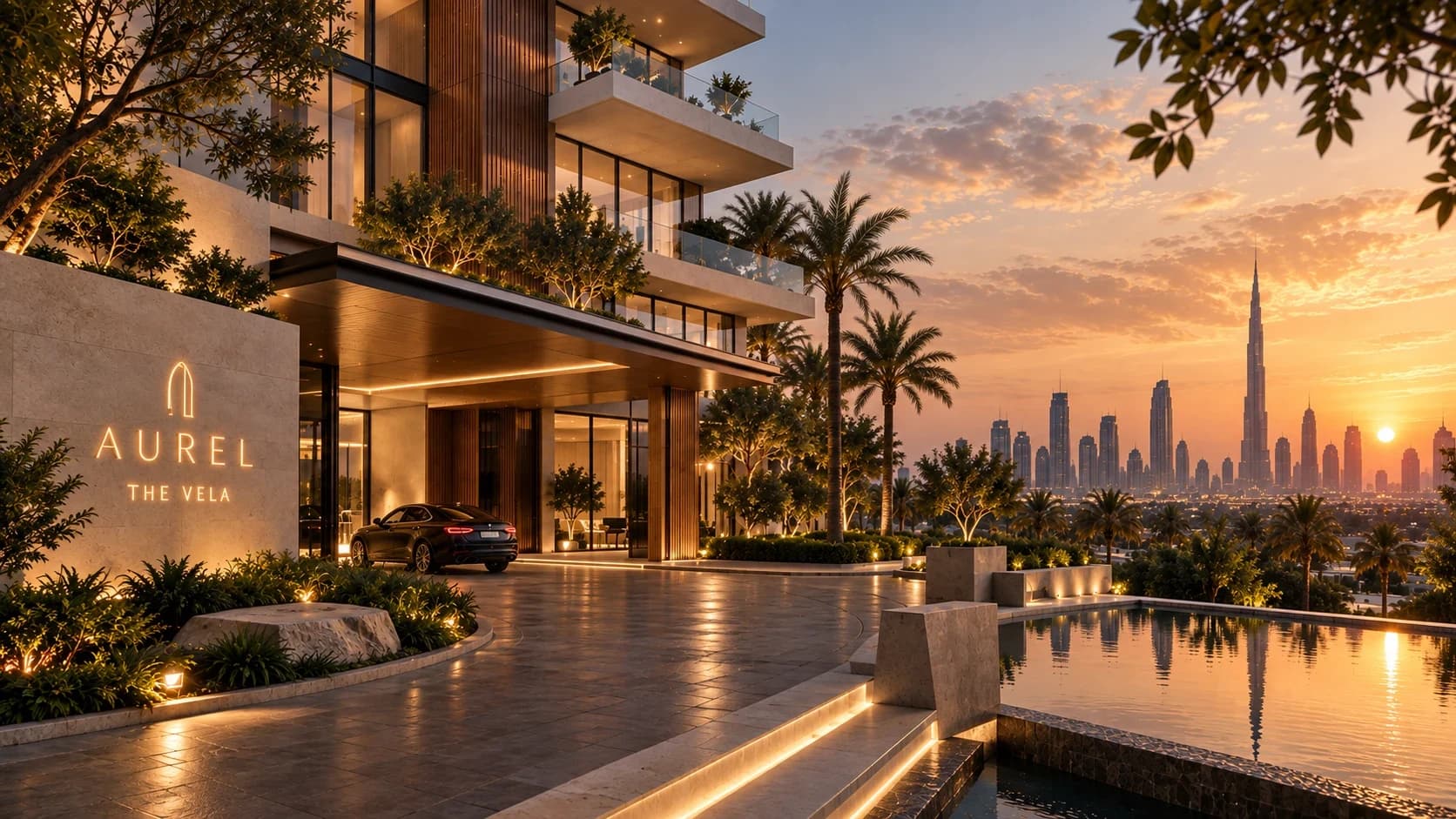
“The property is the interface.” The homepage is sequenced as a walk through the building — arrival, threshold, living, private rooms, terrace — before it turns to location, residences, plans and availability.
Experience
Seven pinned chapters with scroll-driven scale, clip and pan. A residence finder and unit-level availability share one filter model. An interactive floor plan supports zoom, pan, room inspection and download, by mouse, touch or keyboard.
Design
Quiet luxury carried by material, proportion and type: obsidian and warm ivory surfaces, a high-contrast display serif used sparingly, a restrained sans for information, bronze reserved for emphasis.
Development
Next.js App Router, statically generated. Content is a single typed data file. Images are responsive AVIF/WebP with only the hero preloaded. Motion is one passive scroll listener writing a CSS variable; reduced-motion users get the same content with simple fades.
Outcome
A concept, so no commercial results are claimed. The design objectives: emotion before information, full property detail within two scrolls of the story, and an enquiry path that asks only for what a sales team needs.
AUREL and The Vela are fictional. This is a self-initiated concept by OXYVIUM. Residences, areas and availability are illustrative demo data. Nothing here is for sale.